In recognition of the script's historical significance and its modern revival, I want to name the revitalized version Navarāñjanā, combining "Nava" (meaning "new" in Sanskrit) with "Rañjanā," symbolizing the rebirth and contemporary adaptation of this ancient script for a new era.
Prompt: Creating a font inspired by Rañjanā script.
Examples of Original RAÑJANĀ SCRIPT
New Font/redesigned
Consonants
Vowels
OM Symbol
Comparison Between the new/redesigned and the original
Thesis of the overall project:
Discuss the endangered status of Nepal Bhasa and argue that updating it would increase its use and in doing so save it from extinction, preserving a community’s culture and history.
Overview:
Nepal Bhasa is a Tibeto-Burman language spoken primarily by Newars, native to the valley of Kathmandu, Nepal. For my Honors Research and Creative Project, I decided to create a font inspired by Rañjanā script, which is one of the nine writing systems of Nepal Bhasa. Rañjanā script was chosen for the purpose of my project over all the other writing systems of Nepal Bhasa because it is the most elaborate and easily recognized among them. Since most people do not know how to read Rañjanā Script, my goal was to create a practical, legible font. I took some inspiration from the widely used Devanagari script as well. For this project, I focused on the 30 consonants and some vowels, ignoring the numerals, and vowel diacritics of the language.
TYPOGRAPHY:
Garamond, Gill Sans
SOFTWARE:
Adobe Illustrator, Adobe Indesign
Process
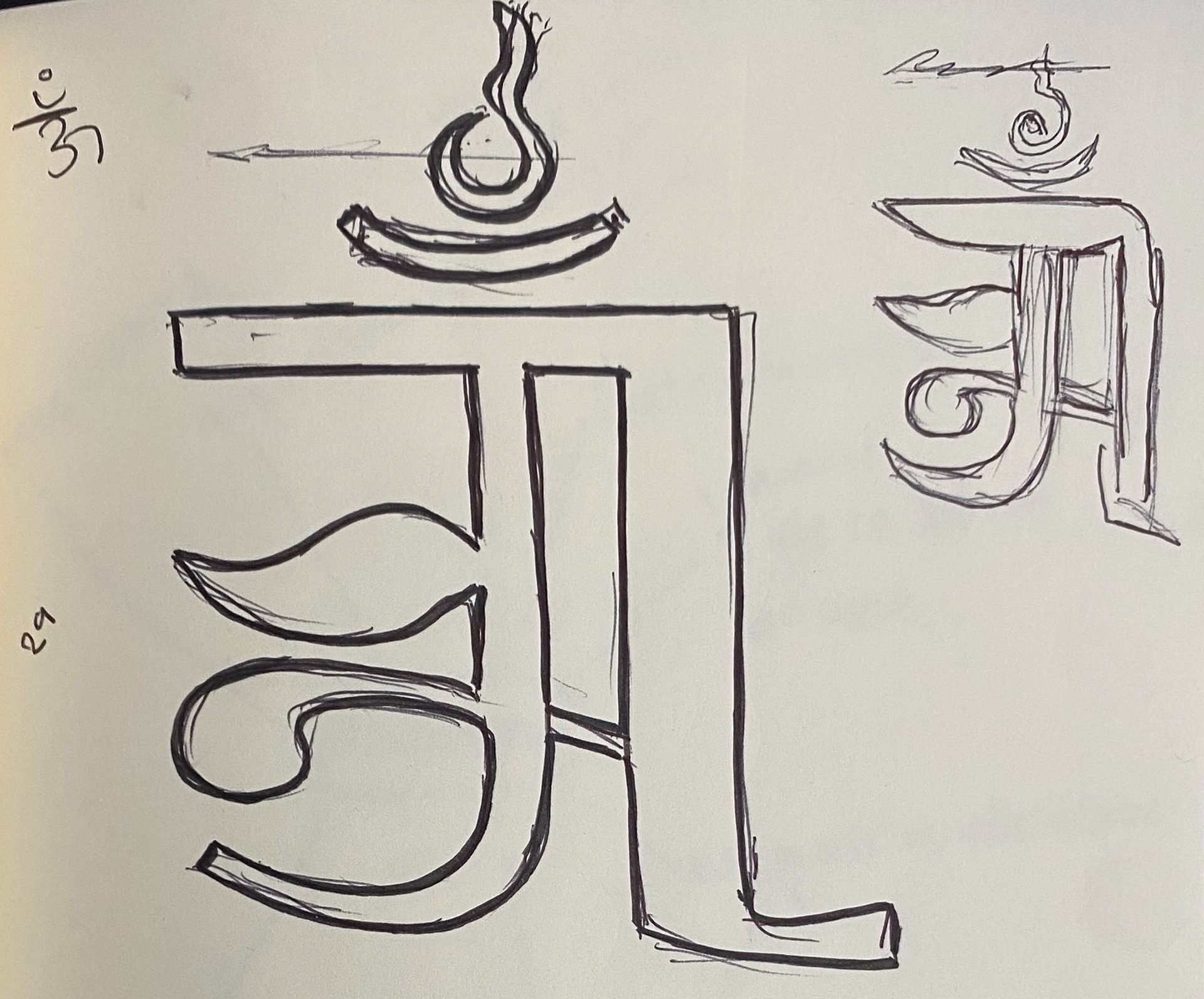
The creative part of this project started as a series of sketches of the Alphabet on a gridded paper. In my initial rough draft sketches, I tried to simplify the strokes in the alphabets while retaining the original essence of the alphabets. I modified the head and the tail in the alphabet and increased the negative space within the alphabets by making the strokes thinner. Then I took the draft and made cleaner sketches with calculated lines.
rough draft
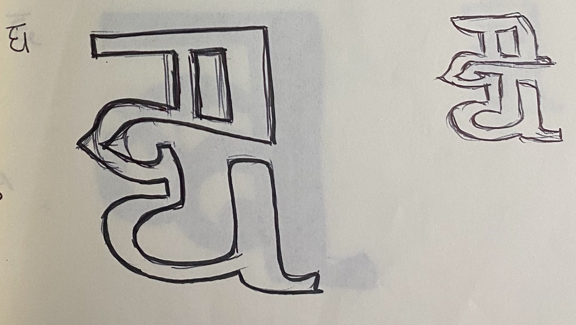
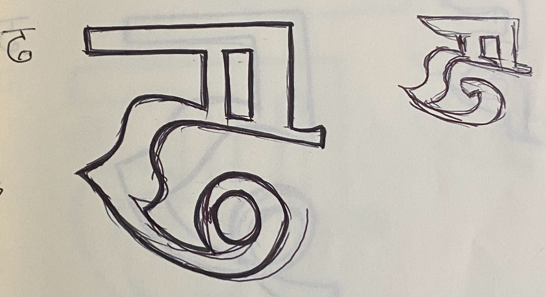
clean sketches
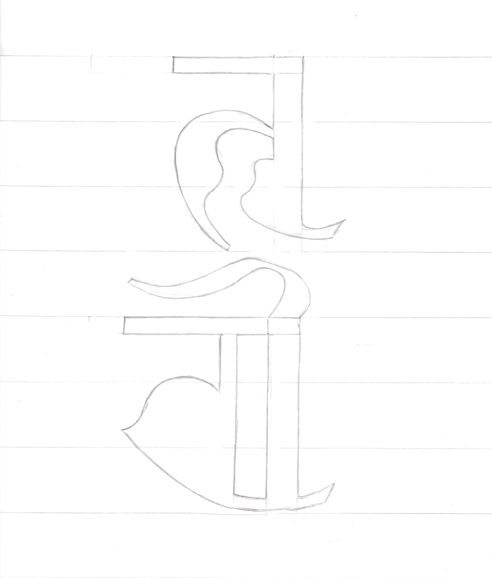
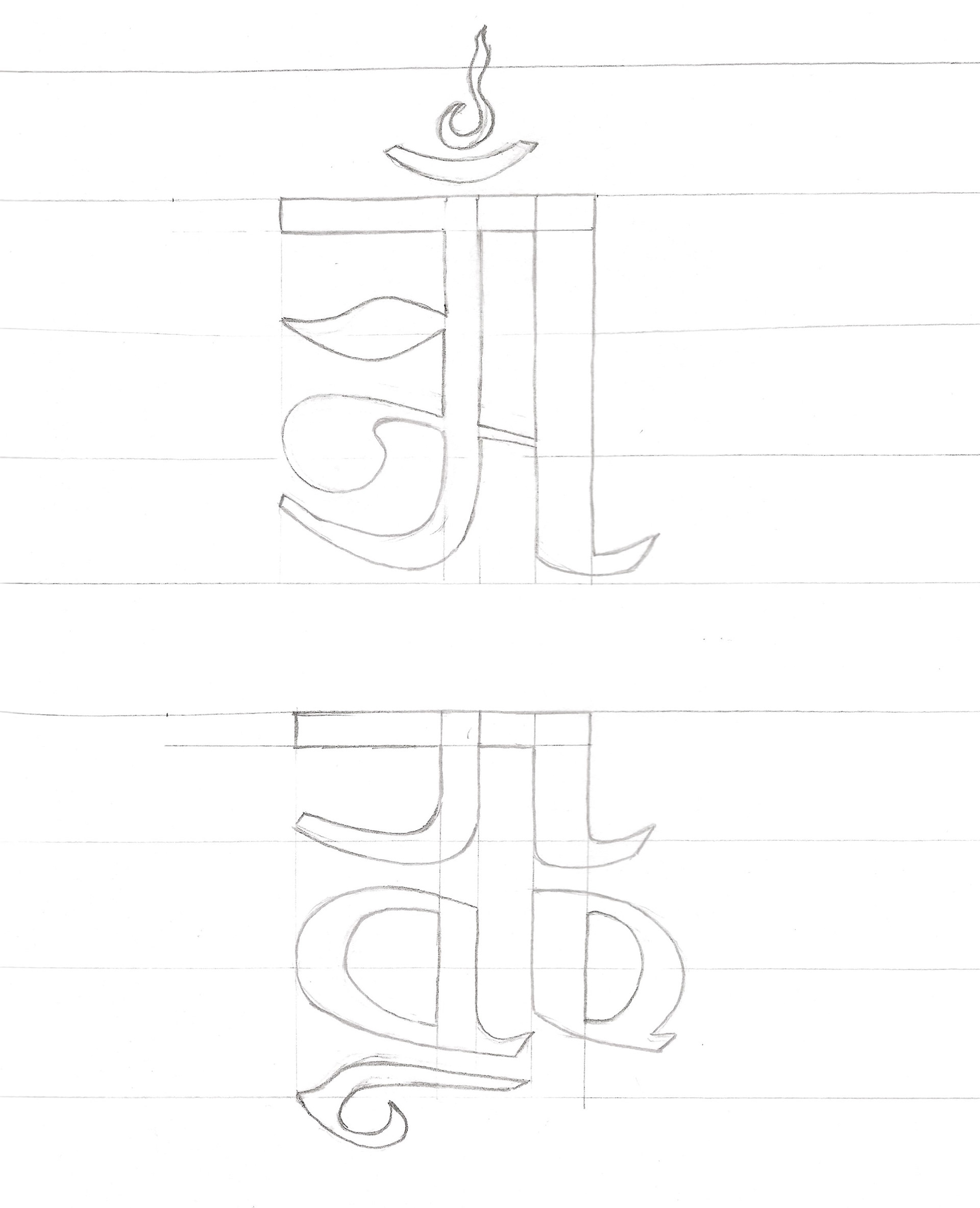
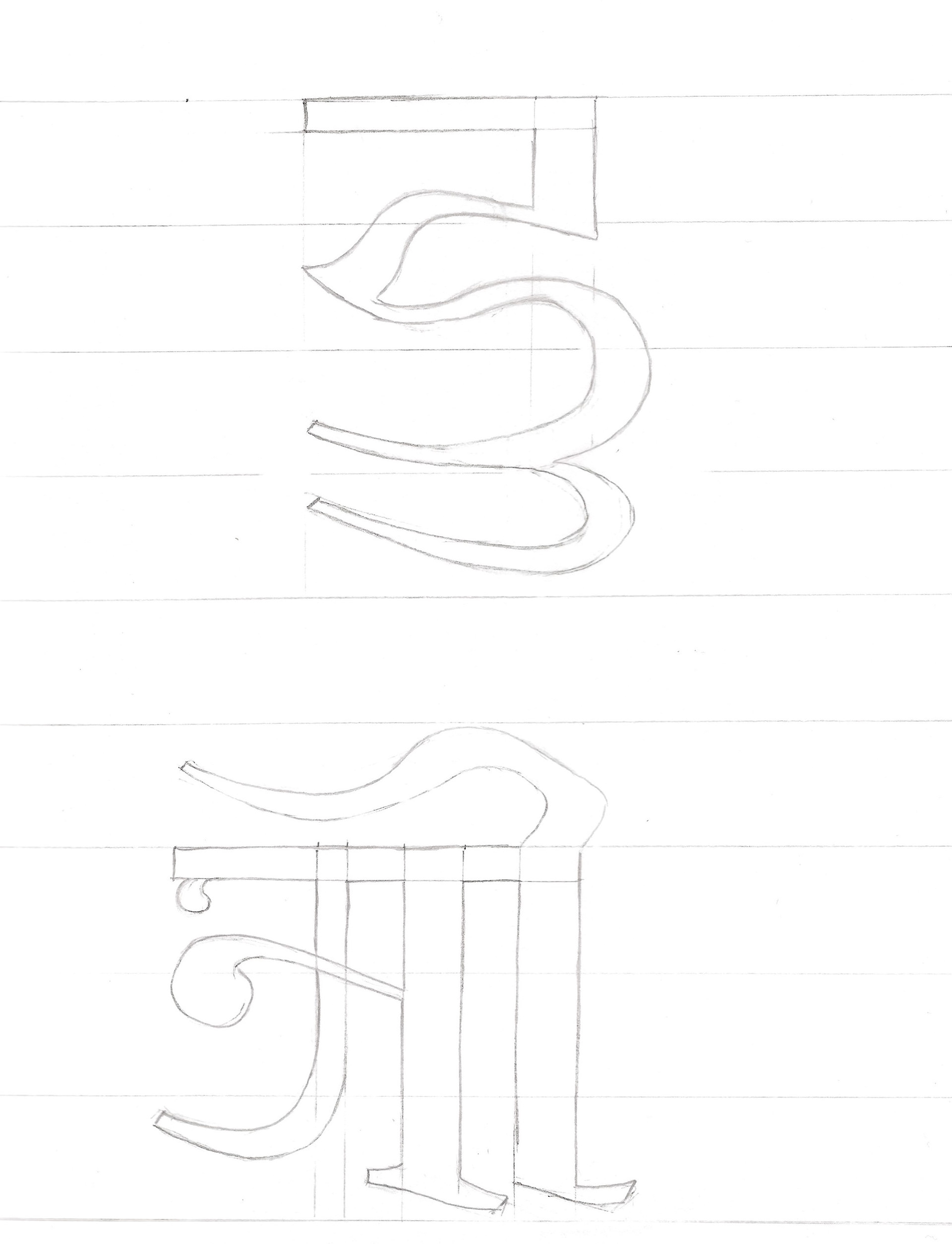
After I designed a cohesive set of alphabet, I scanned the sketches and imported them into my computer. The sketches were rendered digitally through Adobe illustrator. The spiral tool, the pen tool and the path finder tool were my most used tools for designing the alphabets through illustrator. The final alphabets have a good portion of the rectangular edges as well as the smooth curves. The edges and the curves respond to our present reality while tapping into its rich history and culture. The rectangular shapes represent the simplicity of the present and the curves represent the intricate details of history and culture.
The decreased weight of the strokes with the increased negative space makes the font easy to read on small screens and noticeable as people scroll through huge amounts of information each day. The head and the neck in the redesigned letter has been simplified and geometricized while retaining the recognizable features in the body of the letter as shown in Fig A. The tail has been modified to fit the strokes in the body. The contrast between the thick and the thin lines in the letter has been greatly reduced in the redesigned font. These new qualities make the redesigned font suitable for modern day applications such as phones, computers, branding, marketing etc.
How small can we go?
Definitely not smaller than 20px.
You can access the research paper as well as the pdf with audio for the book from the following button

